
Correlation and Best Fit Line
Loading the math board and drawing, please wait…
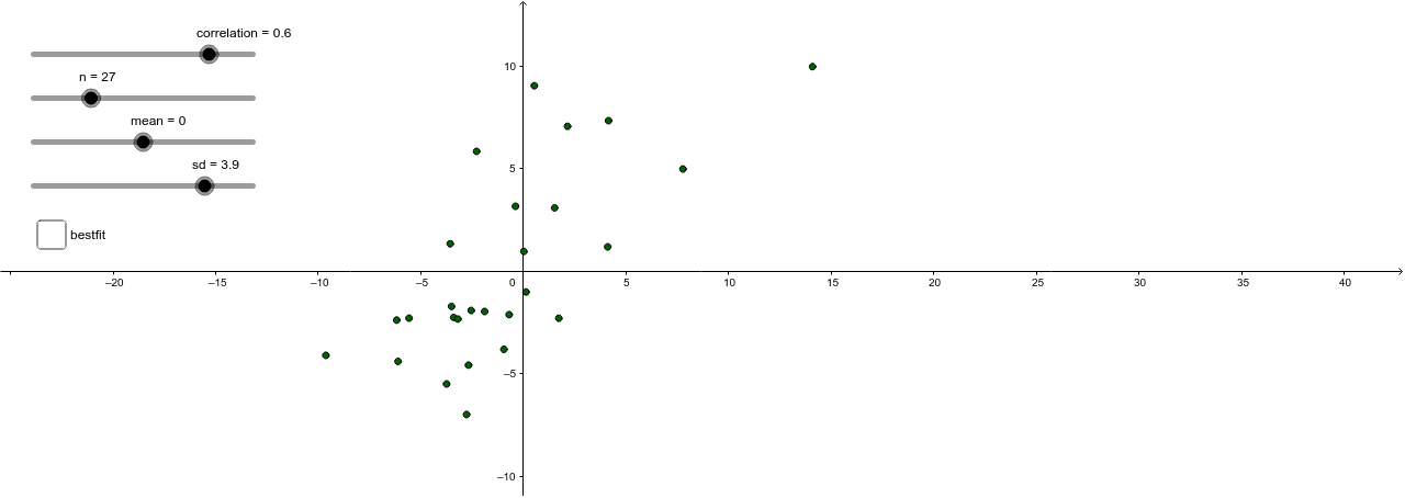
This example demonstrates the correlation between data points in a scatter plot and the best fit line. It involves core mathematical concepts like correlation coefficient, linear regression, and best fit line. GeoGebra commands used include Sequence, Zip, and FitLineY, with objects like ScatterPlot and bestfit. Suitable for high school mathematics teaching, helping students understand data analysis and statistical modeling.
GeoGebra Commands & Parameters
Sequence(RandomNormal[mean, sd], i, 1, n) → YSequence(RandomNormal[mean, sd], i, 1, n) → XZip((a, b), a, X, b, Y2) → ScatterPlotFitLineY(ScatterPlot) → a
AI Drawing Prompt Reference
Create a scatter plot with randomly generated data points whose x and y coordinates follow a normal distribution. Add a best-fit line that captures the overall trend of the points, illustrating linear regression. The graph should clearly show the relationship between the data points and the fitted line, suitable for teaching correlation and linear regression concepts.
The prompt above was compiled from the original drawing commands and is for reference only.