
Connecting Box Plots to Frequency Plots
Loading the math board and drawing, please wait…
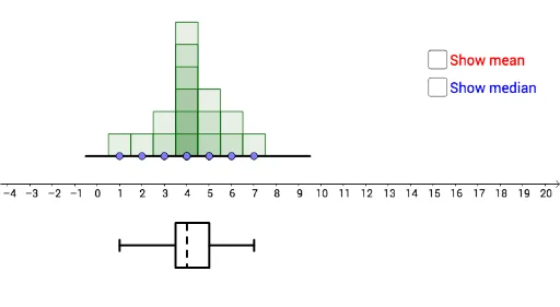
This activity allows students to manipulate a data set to visualize the relationship between the box plot and the frequency plot. Key mathematical concepts include box plots, frequency plots, and their statistical significance. Using GeoGebra commands such as Segment, Frequency, Median, etc., students can dynamically explore data distribution characteristics. Suitable for middle school statistics education.
GeoGebra Commands & Parameters
Segment((0, 0), (9, 0)) → gPoint(g) → MPoint(g) → QPoint(g) → NPoint(g) → LPoint(g) → KPoint(g) → PPoint(g) → CPoint(g) → DPoint(g) → EPoint(g) → FPoint(g) → GPoint(g) → HPoint(g) → IPoint(g) → JPoint(g) → RPoint(g) → OLine(A, B) → fFrequency(list4, list1) → list5Segment((-0.5, 0), (9.5, 0)) → iMode(list1) → list3Mode(list1) → list6Sequence(Sequence[Polygon[(n - 0.5, 0), (n - 0.5, k), (n + 0.5, k), (n + 0.5, 0)], k, 1, Element[list5, n + 1], 1], n, 0, 9, 1) → list2Min({x(C), x(D), x(E), x(F), x(G), x(H), x(I), x(J), x(K), x(L), x(M), x(N), x(O), x(P), x(Q), x(R)}) → minQ1({x(C), x(D), x(E), x(F), x(G), x(H), x(I), x(J), x(K), x(L), x(M), x(N), x(O), x(P), x(Q), x(R)}) → q1Q3({x(C), x(D), x(E), x(F), x(G), x(H), x(I), x(J), x(K), x(L), x(M), x(N), x(O), x(P), x(Q), x(R)}) → q3Max({x(C), x(D), x(E), x(F), x(G), x(H), x(I), x(J), x(K), x(L), x(M), x(N), x(O), x(P), x(Q), x(R)}) → maxSegment((min, -4), (q1, -4)) → bPolygon({(q1, -3), (q3, -3), (q3, -5), (q1, -5)}) → poly1Segment((q3, -4), (max, -4)) → dSegment((max, -3.75), (max, -4.25)) → kSegment((min, -3.75), (min, -4.25)) → eMedian(list1) → medSegment((med, -3), (med, -5)) → l