
Empirical and Theoretical Histograms by Jennifer Loveland
Loading the math board and drawing, please wait…
In collections
Statistical Applets
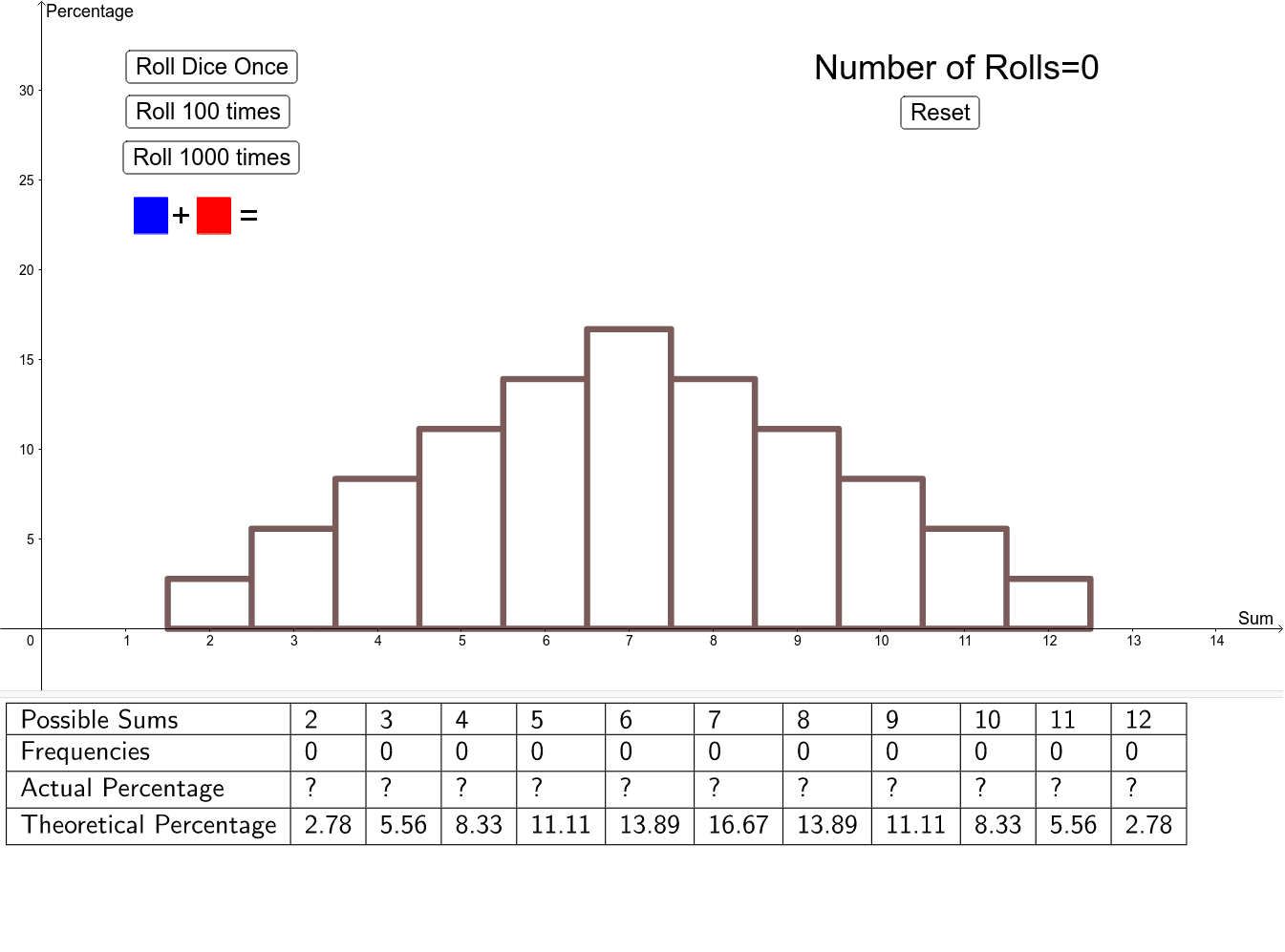
This example demonstrates how empirical (experimental) probabilities converge towards theoretical probabilities as the number of trials increases. It involves core math concepts like Probability & Statistics, Histograms, and the Law of Large Numbers. Constructed using GeoGebra commands such as Polygon, Append, TableText, and Histogram. Suitable for high school students learning probability statistics or for educational demonstrations.
GeoGebra Commands & Parameters
Polygon({(1.1, 22), (1.1, 24), (1.5, 24), (1.5, 22)}) → poly1Polygon({(1.85, 22), (1.85, 24), (2.25, 24), (2.25, 22)}) → poly2Append("Frequencies", sums) → TsumsAppend("Theoretical Percentage", (thProb * 100)) → TthProbAppend("Actual Percentage", (probs * 100)) → TprobsAppend("Possible Sums", PossibleSums) → TpossibleTableText({Tpossible, Tsums, Tprobs, TthProb}, "|_") → text5Histogram(classes, (probs * 100)) → ExHistHistogram(classes, (thProb * 100)) → ThHist
AI Drawing Prompt Reference
Create a histogram showing the convergence of experimental probabilities towards theoretical probabilities as the number of trials increases. First, draw two rectangles to represent frequencies in different intervals, then create a table to display the percentages of possible and actual frequencies, and finally, draw histograms for experimental and theoretical probabilities.
The prompt above was compiled from the original drawing commands and is for reference only.