
Interactive Box and Whisker Plot Construction
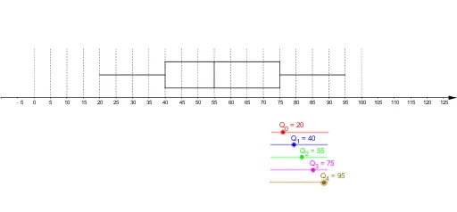
This example demonstrates how to construct a Box and Whisker Plot in GeoGebra, a widely used statistical data visualization tool. The box plot displays data distribution through five key statistical measures: minimum, first quartile (Q1), median (Q2), third quartile (Q3), and maximum. Built using fundamental geometric commands including Intersect, Point, and Segment, this interactive construction allows learners to dynamically adjust data values and observe how the plot responds in real time. By manipulating control points that represent each statistic, students can visually explore how changes in the dataset affect the shape and proportions of the box and whiskers. This hands-on approach reinforces understanding of central tendency, variability, skewness, and the identification of outliers. The activity is designed to help students move beyond rote calculation of quartiles and instead develop a deep, visual intuition for what each component of the box plot represents. Dragging individual points lets learners see how shifting Q1, the median, or Q3 stretches or compresses the box, making abstract concepts like interquartile range and symmetry immediately tangible. The whiskers extend to the minimum and maximum values, and students can experiment with adding or removing data points to see how extreme values influence the overall spread. This interactive exploration supports the development of statistical reasoning skills and prepares learners to interpret box plots found in textbooks, research papers, and real-world data analyses.
In collections
S2,3,5 Statistics
Loading the math board and drawing, please wait…