
Correlation Analysis
Loading the math board and drawing, please wait…
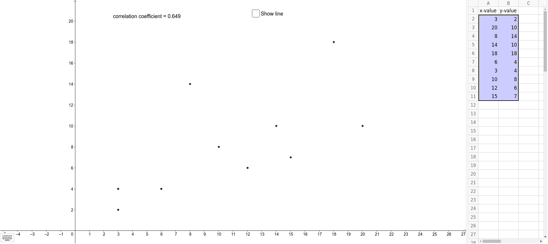
This example demonstrates how to analyze the correlation between two variables using a scatter plot. Key mathematical concepts include correlation coefficient and linear regression. GeoGebra commands such as PMCC and FitLineY are used to construct the correlation analysis graph. Suitable for high school and above students or teachers.
GeoGebra Commands & Parameters
PMCC(list1) → aFitLineY(list1) → f
AI Drawing Prompt Reference
Create a scatter plot to analyze the correlation between two variables, showing the distribution of data points, and include a best-fit line to represent linear regression, with the correlation coefficient calculated and labeled, depicting key concepts in probability, coordinate geometry, and functions.
The prompt above was compiled from the original drawing commands and is for reference only.