
Empirical and Theoretical Histograms
Loading the math board and drawing, please wait…
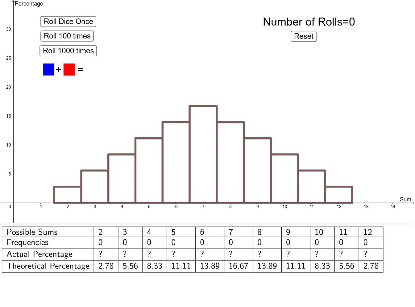
This example demonstrates how empirical probabilities approach theoretical probabilities as the number of trials increases. It involves the concept of histograms and illustrates important ideas in probability and statistics. Using GeoGebra commands such as Polygon and Histogram, the construction of histograms is visually demonstrated. Suitable for high school mathematics, particularly probability and statistics courses.
GeoGebra Commands & Parameters
Polygon({(1.1, 22), (1.1, 24), (1.5, 24), (1.5, 22)}) → poly1Polygon({(1.85, 22), (1.85, 24), (2.25, 24), (2.25, 22)}) → poly2Append("Frequencies", sums) → TsumsAppend("Theoretical Percentage", (thProb * 100)) → TthProbAppend("Actual Percentage", (probs * 100)) → TprobsAppend("Possible Sums", PossibleSums) → TpossibleTableText({Tpossible, Tsums, Tprobs, TthProb}, "|_") → text5Histogram(classes, (probs * 100)) → ExHistHistogram(classes, (thProb * 100)) → ThHist
AI Drawing Prompt Reference
Create a chart demonstrating how empirical probabilities approach theoretical probabilities as the number of trials increases. Include two histograms, one for actual percentages and one for theoretical percentages. Below, have a table listing possible sums, actual sums, actual percentages, and theoretical percentages. Use a slider to control the number of trials, visually illustrating concepts in probability and statistics.
The prompt above was compiled from the original drawing commands and is for reference only.