
Color-Coded Linear Regression Introduction
Loading the math board and drawing, please wait…
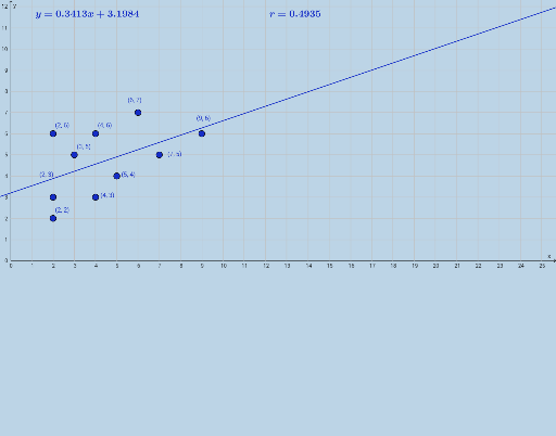
This example uses color coding to introduce the basic concepts of linear regression. It involves key mathematical concepts such as linear regression and the Pearson's correlation coefficient. By using GeoGebra commands FitLineY and PMCC, the relationship between data points and the regression line can be visually observed. Suitable for high school mathematics education and learning.
GeoGebra Commands & Parameters
FitLineY({A, B, C, D, E, F, G, H, I, J}) → fPMCC({A, B, C, D, E, F, G, H, I, J}) → a
AI Drawing Prompt Reference
Create a set of data points, fit a line through them, and calculate and display the Pearson correlation coefficient to visually understand the basic concepts of linear regression. First, create 10 points, then fit a line to these points, and finally calculate and display the correlation coefficient.
The prompt above was compiled from the original drawing commands and is for reference only.