
Creation and Visualization of Statistical Charts
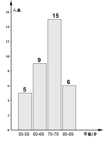
This GeoGebra example demonstrates how to create custom statistical charts using commands such as Histogram, Zip, and Sequence. By constructing list and sequence objects, the applet dynamically generates histograms and other statistical graphs, combined with text objects to display key data characteristics. The interactive interface allows users to modify input data and immediately observe how the visual representation updates in real time, providing a hands-on learning experience. Suitable for probability and statistics education, it helps students intuitively understand data distribution patterns and the underlying principles of chart construction. Through this tool, learners can explore how different bin widths, data ranges, and frequency distributions affect the appearance and interpretation of histograms. The applet also illustrates the relationship between raw data sets and their graphical summaries, reinforcing concepts such as central tendency, spread, and shape of distributions. Educators can use this resource in classroom settings to supplement lessons on descriptive statistics, offering an engaging way to connect abstract numerical concepts with concrete visual representations. Students benefit from the interactive nature of the applet, which encourages experimentation and deeper exploration of statistical ideas beyond traditional textbook examples.
Loading the math board and drawing, please wait…