
From Histograms to Frequency Polygons
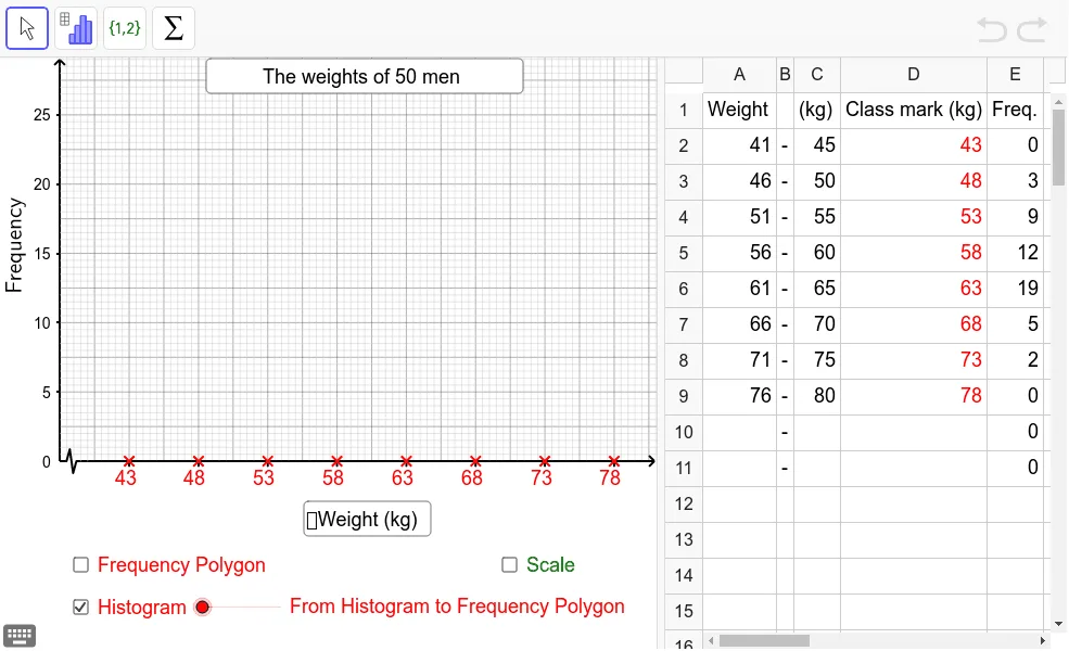
This example demonstrates how to draw a frequency polygon from a histogram and shows how the area enclosed by the frequency polygon relates to the total area of the histogram. Using GeoGebra commands such as Midpoint, Polygon, and PolyLine, it dynamically illustrates the transformation between histograms and frequency polygons in statistics, helping students understand data distribution visualization and statistical features such as the arithmetic mean. The applet allows learners to interactively explore how connecting the midpoints of the tops of histogram bars creates a frequency polygon, and how both representations preserve the same total area, reinforcing the connection between visual and numerical summaries of data. Students can manipulate the histogram and observe in real time how the corresponding frequency polygon adjusts, deepening their understanding of how frequency distributions are represented graphically and how key statistical measures are derived from these visualizations.
In collections
S2,3,5 Statistics
Loading the math board and drawing, please wait…