
Drawing Histograms Demonstration Tool
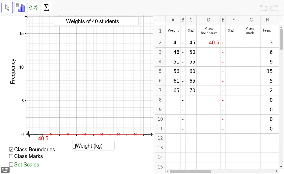
This GeoGebra applet is designed to help teachers demonstrate to students how to draw a histogram to represent a set of grouped data. Through interactive elements and dynamic constructions, users can visually understand the principles and steps of creating frequency distribution histograms, making it ideal for probability, statistics, and data analysis lessons. The tool allows learners to engage directly with the process of organizing raw data into class intervals, constructing bars whose areas correspond to frequencies, and interpreting the resulting distribution. Students can adjust data sets in real time and observe how changes affect the shape and characteristics of the histogram. This hands-on exploration reinforces key statistical concepts such as frequency density, class width, bin selection, and the interpretation of grouped data visualizations. The applet is well suited for classroom instruction, independent practice, or collaborative learning activities, providing an accessible and engaging way to build foundational skills in data representation and statistical reasoning.
In collections
S2,3,5 Statistics
Loading the math board and drawing, please wait…